Google has announced new icons for Google Messages, Phone by Google and Google Contacts, and the change is already starting to reach Android users. At Unfite, we have been watching this rollout closely because these three apps sit on the home screen of millions of Android phones. The google messages phone contacts new icons update, announced on 2 November 2026, is a visual refresh only, and that simple fact is worth stating at the start: your chats, calls and saved contacts will work exactly as they did before.
Google shared the news on its official blog on 2 November 2026, alongside an image showing the three redesigned icons side by side. The new look is sharper and clearer, with a subtle, crisp gradient, easily readable edges, and updated curvature and colouring that align the apps with other Google apps. The shapes themselves have not changed, so you should still recognise each app at a glance. That balance, familiar shapes with a fresher finish, is the heart of this update.
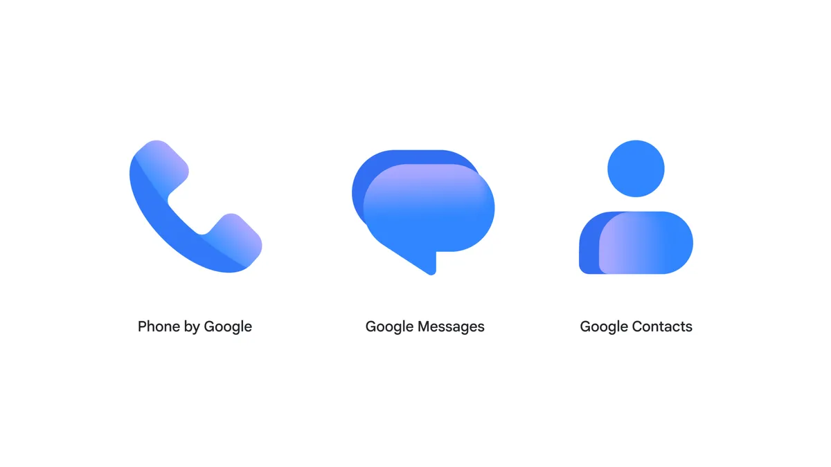
Image Credit: Google — Official new icons image via the Google Blog
What the new google messages phone contacts new icons look like
All three icons keep the symbols Android users already know, but they now share a matching gradient treatment. The result is a set of icons that look like they belong together, rather than three separate designs that happened to sit next to each other. The colouring is bolder without being loud, and the edges are cleaner, which should help the icons stand out on busy wallpapers and in app drawers.
Google Messages: a rounded bubble with a blue gradient
The new Google Messages icon keeps its rounded speech bubble, the symbol most people associate with texting. What is different is the finish. The bubble now carries a blue gradient that moves smoothly across the shape, giving it more depth than the flatter icon it replaces. The bubble still reads instantly as Messages, even at a small size, and the gradient helps it sit comfortably alongside other modern Google icons. For an app used every day for chats, RCS messages and group conversations, that instant recognition matters.
Phone by Google: a handset with a blue gradient
The Phone by Google icon keeps its familiar handset shape, tilted as if ready for a call. Like Messages, it now uses a blue gradient that gives the handset a softer, more polished feel. The updated curvature makes the shape feel smoother, while the clearer edges keep it readable on light and dark backgrounds alike. If you glance at your home screen looking for the dialler, the new Phone icon should be just as easy to spot as the old one, only a little more refined.
Google Contacts: a person silhouette with a matching gradient
The Google Contacts icon keeps its person silhouette, the simple head-and-shoulders shape that has long stood for saved people and phone numbers. It now uses a matching gradient, so it no longer looks like the odd one out next to Messages and Phone. The silhouette remains simple and clear, which is important for an app that many people open quickly to find a number, start a call or send a message. Together, the three icons now tell a single visual story.
What has NOT changed
This is an icon-only change, and Google has been clear about that point. There are no new features in this update, no changes to how messages are sent, how calls are made or how contacts are stored, and no price to pay. The apps remain free, as before. Your conversations, call history, blocked numbers, starred contacts and settings should all stay exactly where you left them. If you were hoping for a new messaging feature or a redesigned calling screen, this is not that update. It is a fresh coat of paint, not a rebuild of the house underneath.
That restraint is actually welcome. Icon changes can be confusing when they arrive with a tangle of other changes, but here the only thing to learn is a new look. You do not need to relearn how to use any of the three apps, and you do not need to change any setting to keep using them. The update is about consistency and polish, not about asking users to do anything differently.
Rollout timing: when will you see the new icons?
Google says the rollout started on 2 November 2026 and will continue over the coming weeks through the Play Store. That means not everyone will see the new icons on the same day. Google has not given a final completion date, and it has not published a device-by-device or region-by-region order for the rollout. If your icons still look the same today, that does not mean you have missed the update; it most likely means your phone simply has not received it yet.
There is one early clue for keen watchers. The latest Messages beta already shows the new icon, which suggests that beta testers and early Play Store updates will be among the first to see the change. The web versions are also expected to follow, with messages.google.com/web and contacts.google.com expected to reflect the new look in time. For now, the main route to the new icons on a phone is a Play Store update to the apps themselves, rather than a system update or a setting you need to switch on.
Why Google is doing this now
Google says the new icons align Messages, Phone and Contacts with the gradient style already used across Workspace and Pixel products. In plain terms, Google wants its core communication apps to look like part of the same family as Gmail, Drive, Calendar and the Pixel interface itself. When icons share a visual language, a phone feels more coherent, and users can move between apps without a jarring change in style.
User feedback has also played a part in this kind of refresh. People notice icons every time they unlock a phone, and small details such as curvature, colour and edge clarity affect how premium and trustworthy an app feels. A sharper, clearer icon can make an everyday app feel newer without changing anything about how it works. Google has applied the same thinking to other apps in recent years, gradually bringing older icons into line with its current design direction.
Pros and cons of the new icons
On the positive side, the new icons look more modern and consistent, they are easier to read at a glance, and they keep the familiar shapes users already know. The shared gradient makes the three apps feel like a matched set, which suits people who use Messages, Phone and Contacts together every day. The change is also low-risk: because nothing functional has changed, there is nothing new to learn and nothing to break in your daily routine.
On the other side, some users will simply prefer the older, flatter look, and any change to a home-screen icon can feel unnecessary at first. Others may be disappointed that a headline update brings no new features at all. There is also the usual rollout frustration: a staggered release over coming weeks means some people will see the new icons long before friends and family members do, which can lead to confusion about whether an update has failed. None of these points makes the update a problem, but they explain why reactions to icon refreshes are often mixed.
Details at a glance
| Detail | What we know |
|---|---|
| Apps affected | Google Messages, Phone by Google, Google Contacts |
| Announced | 2 November 2026, on Google’s official blog |
| What changed | Icons only: sharper, clearer, subtle crisp gradient, updated curvature and colouring |
| Shapes | Unchanged: bubble for Messages, handset for Phone, person silhouette for Contacts |
| Features | No functional changes |
| Price | No price; the apps remain free |
| Rollout | Started 2 November 2026, over coming weeks via the Play Store |
| Beta status | Latest Messages beta already shows the new icon |
| Web versions | messages.google.com/web and contacts.google.com also expected |
| Final date / order | Google has not given a final completion date or device/region order |
How to check for the new icons on your phone
First, look at your home screen and app drawer for the Messages, Phone and Contacts icons. If they already show the new gradient finish, you have the update. If not, open the Play Store, search for Google Messages, Phone by Google and Google Contacts, and check whether an Update button is available for each app. Installing any available update is the simplest way to move to the newest version.
If no update is listed, your phone may still be waiting in the rollout queue. Make sure automatic updates are switched on in the Play Store, restart your phone once after updating, and check again after a few days. Avoid downloading the apps from unofficial sources in a hurry to get the new look; the safe route is to wait for the official Play Store release for your device. You can also check the web versions at messages.google.com/web and contacts.google.com, although those may update on a different timetable from the Android apps. For more Android messaging news, see our guide to WhatsApp smart text actions on Android and iOS.
Unfite thinks: a small change that makes sense
Unfite thinks this is a sensible, if unexciting, update. Icon refreshes rarely make headlines on their own, but these three apps are among the most-opened apps on many Android phones, so a cleaner, more consistent look is a change most users will actually notice. Keeping the shapes unchanged was the right call: it preserves years of muscle memory while still making the apps feel current alongside Workspace and Pixel design. The only real frustration is the staggered rollout, which leaves some users waiting for weeks with no clear date for their turn.
Frequently asked questions about the google messages phone contacts new icons
Do the new icons bring any new features?
No. This is an icon-only change. Google has confirmed there are no functional changes, so messaging, calling and contacts features work exactly as before.
When will I get the new icons?
The rollout started on 2 November 2026 and is continuing over the coming weeks via the Play Store. Google has not given a final completion date or a device or region order, so timing will vary.
Is there a price for the new icons?
No. There is no price and no charge for this update. The apps remain free, and the new icons arrive with a normal app update.
Will the web versions change too?
The web versions at messages.google.com/web and contacts.google.com are also expected to reflect the new look. They may update on a different timetable from the Android apps.
What should I do if I still do not see the new icons?
Check the Play Store for updates to Google Messages, Phone by Google and Google Contacts, make sure automatic updates are on, and wait a few days. If no update is available yet, your device is most likely still in the rollout queue, and there is no setting you need to change.
To sum up, Google Messages, Phone by Google and Google Contacts are getting a matching set of gradient icons from 2 November 2026, with no change to features and no price to pay. The shapes stay familiar, the finish becomes sharper and clearer, and the rollout will reach Android users over the coming weeks through the Play Store. As we note at Unfite, the best way to think about this update is simple: same apps, same features, just a fresher look on your home screen. For the original announcement, see Google’s official blog post on the updated icons for Messages, Phone and Contacts. Sources: Google official blog, 2 November 2026, and 9to5Google, 2 November 2026.
Key takeaways on the google messages phone contacts new icons
- The google messages phone contacts new icons change was announced on 2 November 2026.
- The google messages phone contacts new icons rollout is happening over the coming weeks via the Play Store.
- The google messages phone contacts new icons keep the same shapes, with a sharper gradient finish.
- The google messages phone contacts new icons bring no new features and no price.
- The google messages phone contacts new icons are already visible in the latest Messages beta.
- The google messages phone contacts new icons should also reach the web versions in time.
- The google messages phone contacts new icons make Messages, Phone and Contacts look like one family.
- The google messages phone contacts new icons use a blue gradient for Messages and Phone, and a matching gradient for Contacts.
- The google messages phone contacts new icons are a visual refresh, not a redesign of how the apps work.
- The google messages phone contacts new icons will arrive at different times for different phones, because Google has not given a final completion date or device order.
5 thoughts on “Google Messages, Phone and Contacts Get New Icons on Android: What Changed on 2 November”